Digital content in partnership with:
IMDA

Objective
This project aimed to communicate the value of Singapore’s IMDA Accreditation Programme to high-growth B2B technology start-ups looking to scale in the city-state and across Southeast Asia. Through an online article supported by infographic-style content, the piece breaks down the programme’s rigorous application process, eligibility focus, and key benefits, while using case studies of Kong, Yugabyt,e and Confluent to show how IMDA accreditation can help emerging tech companies build credibility, navigate procurement barriers, rs and connect with government and enterprise opportunities.

Article Overview

Moodboard, colours and typography
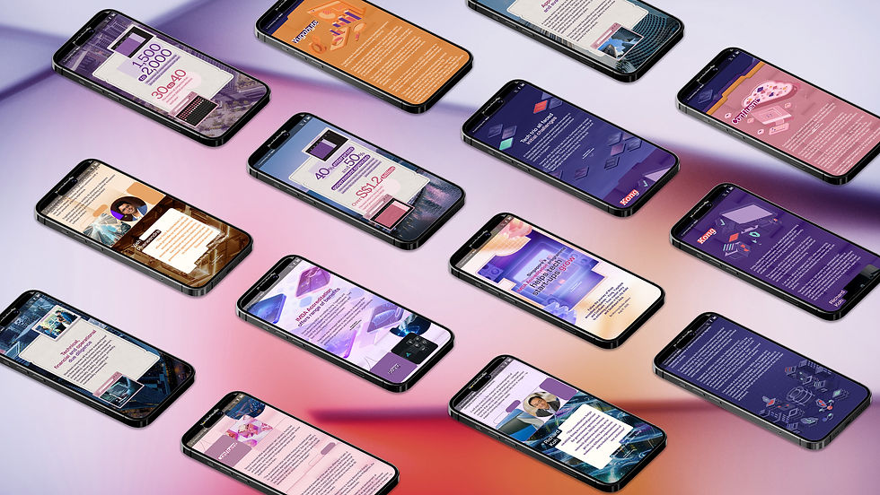
For this project, the visual direction was developed around a minimal yet futuristic digital aesthetic, with a focus on highlighting the fintech and enterprise technology elements of the article. The colour palette mainly followed IMDA’s brand guidelines, using purple and magenta as the core colours to maintain brand consistency while creating a strong, recognisable visual identity.
To communicate abstract technology themes such as cloud storage, data transfer, and digital infrastructure, we have explored the use of gradients, glowing colour transitions,s and 3D visual objects. These elements helped translate intangible services into a more engaging and accessible visual language, giving the article a stronger sense of depth, motivation, and innovation.



Introduction
Desktop / mobile version
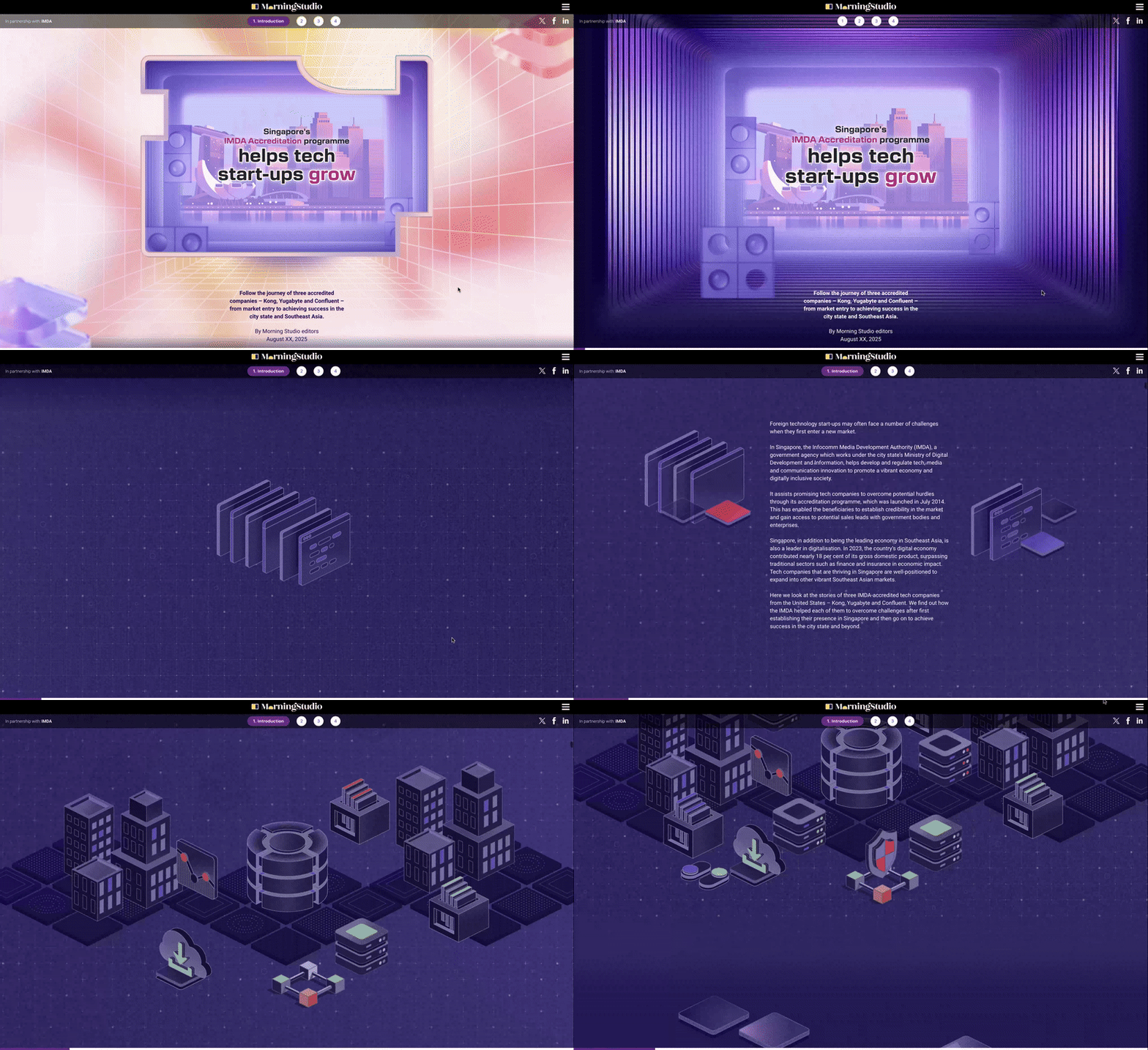
The introduction creates an immersive journey that brings readers through a tunnel-like transition into a virtual digital space. The scene first lands on the Singapore skyline, setting the context of the article within the country’s technology ecosystem.
The visual world then expands into an IMDA case study environment, built with abstract digital data blocks that symbolise data storage, transfer and cloud infrastructure. This approach sets a futuristic tone for the article while connecting the user experience to the themes of technology, connectivity and digital transformation.

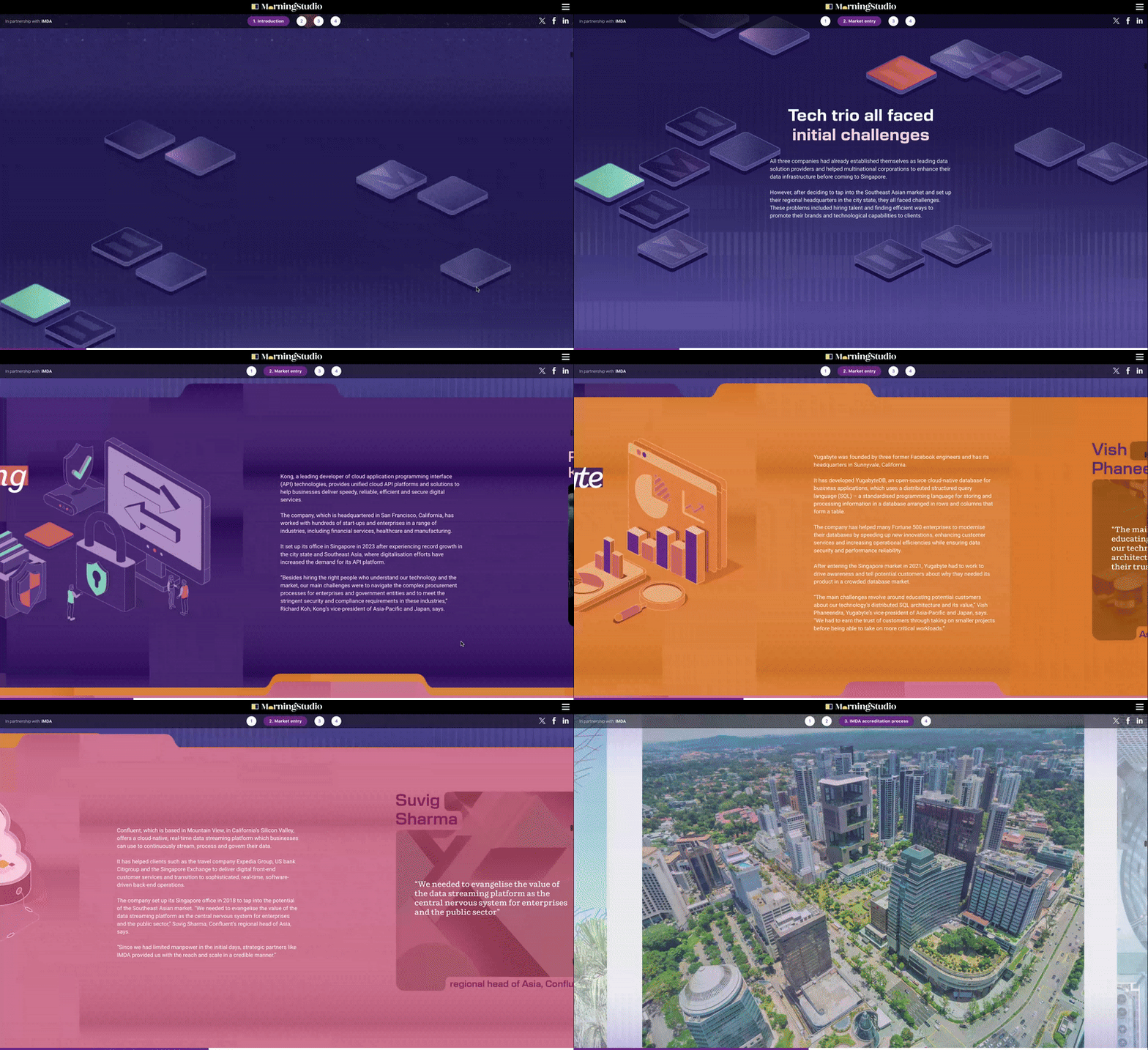


This section introduces three start-up companies that successfully received IMDA support, using their stories as an entry point to discuss the challenges they faced during the early stages of business growth. By presenting their initial difficulties, the section helps readers understand the common barriers start-ups may encounter when entering a new market, such as building credibility, gaining customer trust and navigating business opportunities.
The design adopts a more minimal visual approach, using simple graphic elements to strengthen the sense of digitalisation while leaving room for interpretation. This restrained visual style reflects the uncertain and less-defined nature of a start-up’s early journey, where ideas, opportunities and market positioning are still taking shape.
Section 1 : Market Entry
Desktop / mobile version



Section 2 : IMDA Accreditation process
Desktop / mobile version
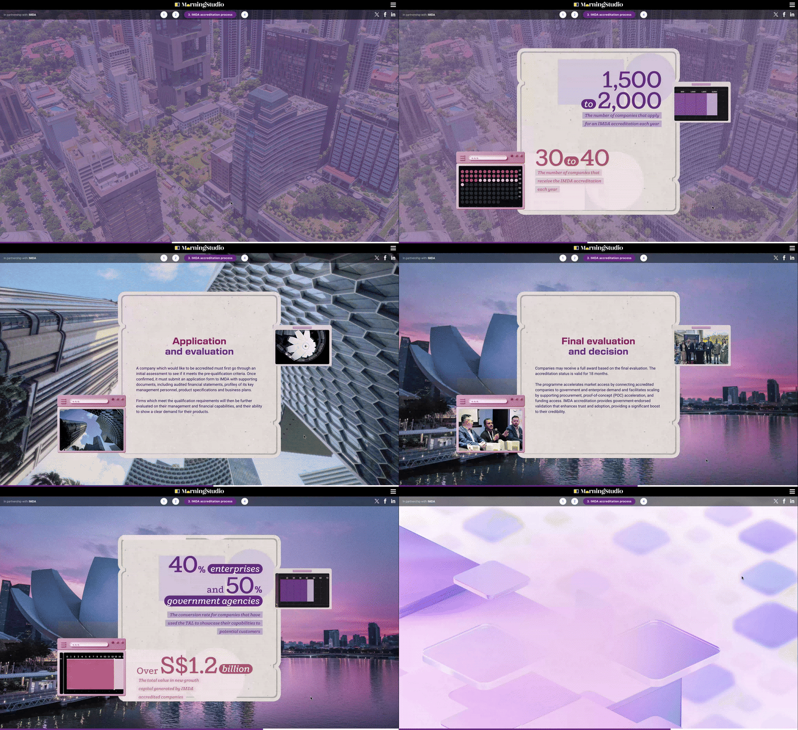
After introducing the start-up challenges in the previous section, this part shifts into a more practical step-by-step guide, explaining how companies can take part in the IMDA programme and apply for support. The content is structured to help readers understand the application journey clearly, from the initial requirements to the key information they need to prepare.
Visually, this section incorporates more infographics, icons and data-led elements to support the explanation and make the process easier to follow. To make the programme feel more tangible and grounded, real images and subtle analogue design touches were added, balancing the digital theme with a stronger sense of authenticity.
Interactive animations were also implemented to streamline the reading experience and guide users’ attention towards the four key points they need to understand during the application process.


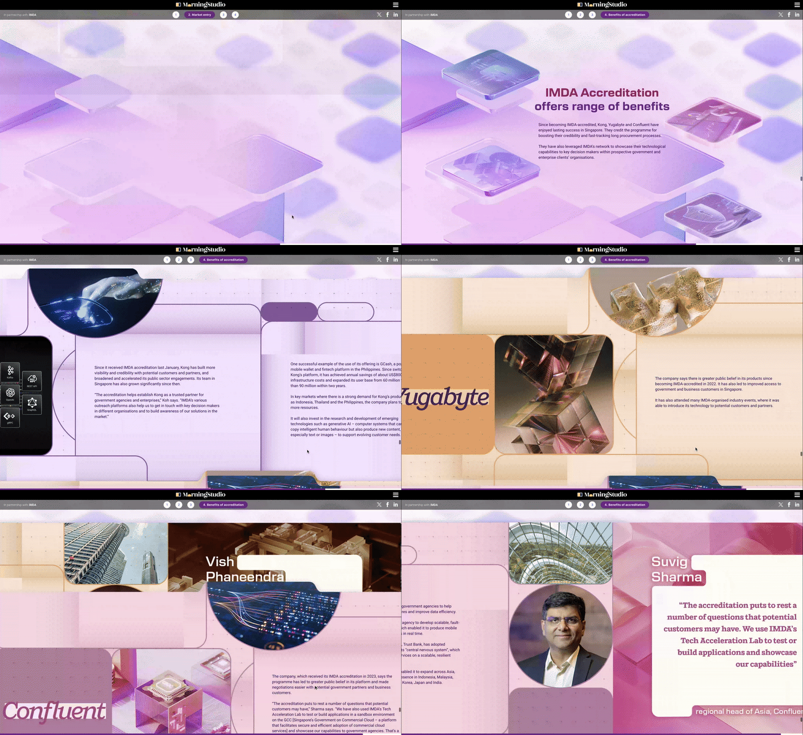
Section 3: Benefits of Accreditation
Desktop / mobile version
The final section returns to the three company case studies introduced in the Market Entry section, using their successful outcomes to answer the challenges presented earlier in the article. This creates a clear narrative arc, showing how the IMDA programme helped these companies overcome early barriers and move towards growth.
The design keeps a consistent structure with the earlier case study section, using archive document-style dividers to separate the three stories. More real imagery was added to strengthen the programme’s credibility and make the outcomes feel more tangible.
The colour palette also builds on the first section, with increased saturation to create a brighter and more optimistic atmosphere, symbolising the positive future enabled by the programme.
Click here for the full article